_______________________________________________________________________________________________________________________________________
Showing posts with label Skills Development. Show all posts

Digipak Construction

Wednesday, 18 February 2015

Font
The thank you note in the digipak is a space for the artist to write a sincere note directed to the fans. I wanted to portray this personal aspect through the font, and decided to create my own using my own handwriting to demonstrate this.

Using the website myscriptfont.com, I downloaded the template below that I then opened in Photoshop. Filling it in using a pen tablet, I was able to transfer my handwriting digitally, before uploading it to the website. This then converted my handwriting into a vector font which I am able to use within the digipak.


Barcode
As my planning outlined a monochrome design, rather than placing a found image of a barcode that often is either not transparent or features a conventional black banding, I decided to create my own. This enabled me to create a white transparent version that I can edit at any point. Using Photoshop once again, I created a brush 1px wide and 100px tall, and added this to my brush presets. From here, I changed the spacing of the brush to 100% and the count jitter to 120% causing the random banding that forms the actual barcode.

After placing this image into InDesign, I decided to remove the '3' and '0' from the edges of the barcode to create a more streamlined aesthetic that fitted well with the otherwise linear composition.


Outside Drafts
When constructing the digipak, I decided on these variations below. Whilst these are subtle, I intend to print each of these off to see how they look in print.

The above outlines my original design intentions through the planning. I decided to use the Arial Black font throughout to match the logo, listing the track names in a more graphical fashion. I personally find this combination slightly too impactful and linear compared to the circular front panel. Despite this, I do like the way the tracks list is arranged, filling the space well without becoming overcomplicated.

After printing these to get a sense for each colour, I actually really like the darker spine which is especially effective in linking these panels together. The thank you note on a panel on it's own is also rather impactful, which is evident in print, connoting the directness of the message to the fans.

Retaining the format of the track list, I used my own handwriting font that I created originally for the thank you note alone. I find this font impactful yet not overwhelming, with greater emphasis on negative space within each letter. In my research, I liked how The King Blues used handwritten font for each of their song titles, and this method transfers well to this digipak.

For this design I used grey as the background for the spines, but when this was printed the black version above was more aesthetically pleasing. I want to develop this design further, starting with changing the spine background colour.

Possessing the same features as the previous design, this version features quite an unconventional continuation of the spine through the different coloured background. This was quite effective for the back panel, however the inside flap with thank you note was really ineffective, with the off centred text and blank space distracting from the main message. The back panel is more successful, however the legal text and barcode would need to be shifted to the right to balance the layout more. Although, because the black spine was really effective, I won't be continuing this design due to the need of a different coloured spine.

A more obvious use of the psychedelic design than that in the planning, this is significantly different to the other drafts. The burst of colour on the front is balanced with a more muted purple taken from the front image. The white text contrasts against this background effectively, with the track list in a more conventional layout, integrating the circular design from the original logo also. The use of Arial Black from the logo follows what I had outlined in the planning, yet the handwritten thank you note does not overcomplicate the product, almost making this addition more personal.

I find this design slightly too dark, especially comparing it to the otherwise bright and vibrant video. Whilst the design is effective digitally, I found that it lost definition when printed. I think a brighter image will portray the otherwise colourful indie-psych genre more effectively, appealing to the target audience once more.

The previous pattern did not transfer well to the spine design, so I decided to use an image I had taken during the planning stages which had a greater amount of colour. Personally, I really like this design. It encompasses the vibrant indie-psych genre, as well as holding a slightly muted palette which can be likened to the 70s aesthetic. Accents such as the coloured spines create cohesion across the design, and is something that I believe can be developed for the inside sections.

With the success of the previous design, I used another photo from the planning process. Looking at the composition in general, I like how there is a greater variation between the black and white text, as the previous example I found the dark 'bonus tracks' buzz words quite distracting. The circular logo on the front panel is very eye-catching, but overall I still prefer the previous example as it appears more cohesive across the three panels.

In order to develop the previous example more, I shall change the logo to the circular example from the last one, as well as either tone down the buzz word colour, or change the thank you note colour to draw the attention away from this section. I also need to align the barcode with the track list and ensure that each section is to the correct width.

Inside Drafts
Developing the three most successful outside drafts, I looked back to my research in order to conform to conventions of a digipak. Each feature a pocket, CD with info, and the logo in the centre. The central logo is a clear focal point, reinforcing the brand identity which is especially vital as they are an unsigned and emerging band. The CD features the band logo once again, as well as the track names and durations, with the latter otherwise absent from the outside. Legal information conventionally circles the outside using a text on a path, with the disc logo also added to follow conventions. Upon viewing these drafts, I find the first and last versions most successful, spreading the focal point across the product, with an even dispersal of colour which is lacking from the middle draft. I shall show the two drafts mentioned to the target audience in order to gain their opinion on these versions.


Digipak Design Planning

Thursday, 22 January 2015

When constructing this mood board, I considered both the music video and the indie-psych genre in order to strengthen the brand identity of this promotional package. I particularly liked the psychedelic patterns and faded aesthetic that is conventional of the indie-psych genre, yet I also like Bowie's uniformly monochrome digipak that I analysed. The idea of stripping back the digipak to monochrome, just as the song is stripped back to a retro, 60's sound.


Whilst I like the idea of having a minimal design, as this is for an emerging band, I worry that this bold choice will not impact upon potential fans. Because of this, I have decided to further explore imagery associated with the indie-psych genre, as well as that which can be linked to themes within the music video, strengthening the brand identity across the promotional package.
CLICK HERE TO VISIT THE MOOD BOARD BLOG

After collating these images together, the abstract patterns and harmonious palettes are something that appear in the music video, so in order to heighten the brand identity, I will try to create some of these patterns.

Constructing these patterns is something that I am fairly new to. Researching further into these patterns, I discovered that there are two possibilities for creating them, either traditionally using oil in water, or digitally using Photoshop. As I am confident in photoshop, I decided to give try this technique, varying the gradient tool and blend modes to create unique and unrepeatable effects. Below is a screen capture of this process:


Screenshot of Flickr Album
The images from this test are in this Flickr album HERE
After experimenting with the creation of these psychedelic patterns using Photoshop, I am quite impressed by the variation achieved in a relatively short time frame. Whilst this creates a fluid aesthetic that is comparable to the indie-psych genre, these can come across as quite processed due to their digital creation. Some of these patterns are also too varied, I personally prefer the more muted designs such as the bottom left version above. I shall experiment more with the creation of these gradients digitally, and should they not achieve the desired aesthetic, I will move to a traditional process, drawing upon my art skills instead.

Continuing layering gradients using Photoshop, this became difficult to predict, with each result varying from the previous. Keen to pursue this technique, using a paintbrush tool, I layered saying vibrant colours on the canvas, before using the liquify effect to turn it into the psychedelic pattern below. The bold, controlled palette possesses an indie-psych aesthetic that I aimed to achieve with the original designs, inspired by my research.


While I like this pattern, I feel that this is lacking the physical, hands-on element that the artistry of the indie genre connotes. I shall reserve this as a strong possibility, but I will try using inks - of which feature heavily in the music video - to create a psychedelic pattern, strengthening the overall brand identity.

Constructing the prints, with pictures of the mixed ink.
Interestingly, the ink designs below were just as unpredictable as the digital designs. Using mainly primary colours, I laid paper in the tray of ink, removing the paper to reveal the patterns below. Personally, I really like these, featuring texture and depth that I have consciously aimed to maintain within the music video. Such connections encourage me to develop these further, combining them with text to see how the digital and traditional designs compare with this addition.

Edited scans of prints that are to be developed.
After editing these prints in Photoshop, mainly to increase the vibrancy as the scanning dulled the images,  I combined them with the previously developed band logo to see if they could be adapted to form a front cover for the digipak.

Please hover over the white circles below for annotations of each image.

I personally liked the last two examples from above the most, but I feel that the photo of ink holds better links to the music video over the version I created in Photoshop, as well as aesthetically possessing greater depth and tone than the otherwise flat digital version.

Whilst I like the photo, I find that the variation in colour makes the band logo quite hard to read in places, distracting from this vital element in order for the audience to recognise the artist. Because of this, I used the layer blend mode luminosity in Photoshop to create a darker yet vibrant aesthetic that I personally really like. I intend to use this technique for the introduction, furthering the link between the ancillary products and the music video.

I also felt that the solid white logo appeared disjointed against the otherwise fluid background, so I altered the transparency of both the black and white versions in an attempt to blend it more with the image. The result achieved this, but they both looked slightly too subtle. The white version was more legible than the black, so when I refined this further, I decided to continue with the original white variation.

An increase in opacity resulted in the image below. This encompasses my design intentions, and in my opinion, if this was not successful as a digipak cover, this could certainly be part of a booklet design as per my original intentions.


Colour Grading

Wednesday, 31 December 2014


Double Exposure Techniques

Thursday, 25 December 2014

After Effects Workshop 3 - Particle Effect

Friday, 14 November 2014


After Effects Workshop 2 - Motion & Multiply

Wednesday, 5 November 2014


After Effects - Title Glitch

Sunday, 2 November 2014


When creating the secondary source mood board, I came across some After Effects tutorials on Youtube, such as the one below. I decided to try this 'glitch' effect as it uses expressions which are a feature of After Effects which I have been wanting to try.


In order to have a foundation for this video, I decided to use the logo of the band I am using with their permission. Placing this image into photoshop, I created both transparent, monochrome, and stencil versions of this logo, which could be useful in future tests. The one thing which inspired me about the video above was the original simplicity of the logo, so I also isolated just the text from this logo, creating a slightly edgy, handmade feel to the final image, relating back to the more retro style of their music.

After isolating the logo, I transferred this into After Effects, along with some stock glitch footage which is available to use as part of the tutorial. Using a displacement map, I displaced the text (image) layer from the glitch footage, resulting in a clean glitch effect. I then staggered this effect across the 7 second clip, and varied each vertical and horizontal displacement to add interest to this feature.


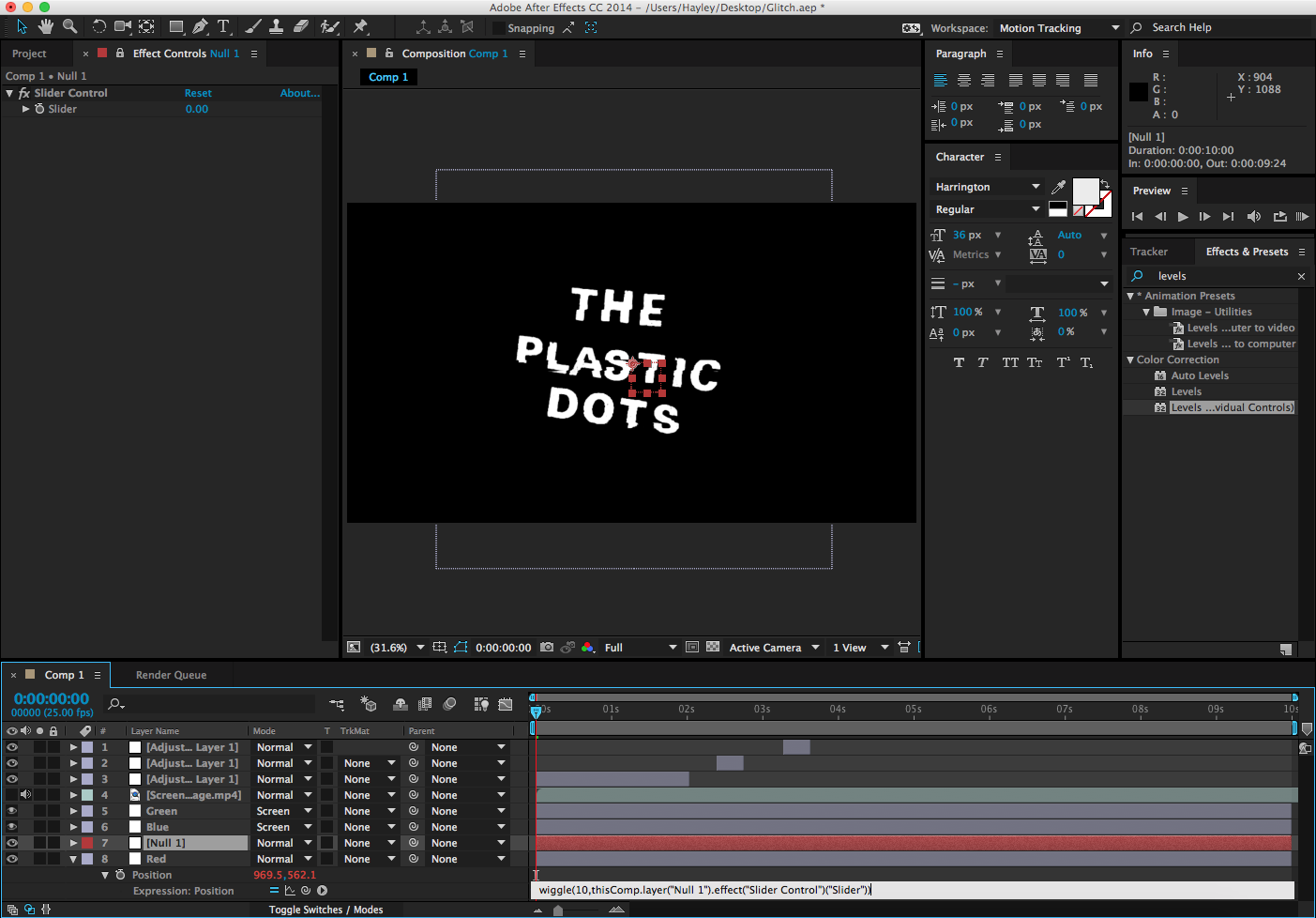
In order to soften the glitch and create an effect similar to an older TV (relating back to that used by Dmitri Basil in the Riptide video) I used an expression, wiggle, to do exactly that. By creating a null layer and typing 'wiggle(10,' this set the value of the expression. then, clicking the spiral button, I linked this to the slider control, meaning that whatever I set the slider to, this will effect the intensity of the wiggle. Despite only touching on expressions, they are far more simpler than having to animate each individual keyframe, and could be useful in my final video.

Taking this a step further, I then isolated each layer into red, green, and blue channels using the 'Levels (individual controls)' effect, and setting the layer mode to screen. From this, I decided I wanted to separate the red channel, so used the shortcut 'P' to open the position tab, before altering this, resulting in the red/blue shift above. This was effected by the expression and displacement map, resulting in an effect you would see on an old, broken monitor.

Overall I'm really pleased with this title effect, and could see it being used either at the start or at the end of the video. As it is transparent this can be overlaid onto existing footage, making it a versatile title.

Practical Pre-Production - Double Exposure Test 3

Saturday, 18 October 2014


After the first double exposure test, I researched into online tutorials which could refine the double exposure effect. Once I had experimented myself into refining the double exposure technique (evidenced in the second double exposure test) I found this double exposure After Effects tutorial below on Youtube.


Described as 'medium difficulty' this tutorial used techniques which I have used in the past, as well as some which I haven't yet come across. Free footage was also available with this tutorial, and I decided to use the tree, dust, and lens flare footage to see if I could get a final result similar to that in the video. I used my own green screen footage of James. Documented below is the progression of my own work following the tutorial, compiled in the online software Canva.


Whilst the end result perhaps does not have as much definition on James's facial features, there are definitely certain aspects to this video which I will continue to refine:
• Using 'Add' to blend the background into the double exposure, creating a more harmonious composition.
• The use of a pan in the background footage, and then duplicate this in a new layer and fragment it, adding depth to the overlaid footage.
• Creating an edge blur by manipulating the blur and shrink/grow transformations within the screen matte to further blend the double exposure with the background. 

After Effects Workshop 1 - Key Frames

Friday, 17 October 2014

Below is the results from an After Effects I attended. As I intend to use After Effects heavily, these sessions will further my knowledge of this software and aid the editing process.


This session covered animation and key frames, using shape and text layers to create various moving parts in a title sequence. Using the transform tool I manipulated: opacity, rotation, scale, anchor point, position, skew, and blur to create varying effects. In order to create smoother transitions between these effects I used Easy Ease on some of the key frames, which removes any jitter in the movement between each key frame.

Anchor Point & Rotation: The yellow star has been manipulated using both the anchor point and rotation transformation tools, with the anchor point the location which the star rotates around. By selecting the start and ending point with two key frames, this caused the star to rotate once around the anchor point.

Scale: Using 3 key frames for the large circle, I used the scale tool to grow and shrink the shape. Setting the shape from 0% (invisible), grow to 140% (larger than normal size), then down to 100%, causing the shape to grow to larger than normal and shrink back to normal size.

Transparency: On the smaller circle, I used two key frames at the beginning and the end of the clip to make the shape appear from nothing. In order to achieve this, the value of the first key frame was 0%, and the second key frame's value was set at 100%.

Position: Used on the "Title Text" text layer, here the position transformation moved the text layer from out of the frame to the centre of the frame, using two key frames and motion blur to smooth this transition. This transition can be created through placing the object in the start position before moving it to it's final position, and the software blocks in this movement automatically.

Practical Pre-Production - Double Exposure Test 2

Wednesday, 15 October 2014

One thing I found with the previous multiple exposure was the final result appeared quite flat and stencil-like, with just the sheer outline masking the time lapse clip. In this test I wanted to experiment with creating depth within the original green screen footage.

Despite being only 4 seconds long, this clip took around 3 hours to edit, which I believe will decrease as I become more confident using After Effects. Because of this, I am keen to refine the technique and various effects which create the final result to hopefully lessen the time spent creating each double exposure in the final video.


In order to emphasise the impression of 3D on this 2D footage, I created a vignette which will draw the focus to the centre of he frame, where the action is happening. Also, the vignette will lesson the appearance of the double exposure 'floating' in the sequence.
In the previous experiment, Displacement Maps were used to alter the time lapse footage in an attempt to add depth and interest to the background footage. Here I used a Displacement Map on the green screen footage layer, so the face will displace the background footage, and add definition to James's features. Whilst this does create depth, this looks almost Solarised, which results in a loss of realism in this sequence. The Displacement Map was effective in adding depth to this piece, I will be experimenting with adjusting shadows and highlights to create a more natural aesthetic.

Practical Pre-Production - Star Trails

Monday, 13 October 2014

After my previous unsuccessful attempts of getting a time lapse of the night sky, I decided to try to capture star trails instead. The image above is composed of 17 images each with 30 second exposures with an ISO of 600. A time consuming but rewarding process, this star trail captures just a part of the sky, but I am pleased with the effect I achieved, especially for my first attempt. As I do not own a remote trigger I had to continually wait and press the shutter, which was laborious. The images were taken using a Fuji x20 and have had no colour correction.

In order to combine all of the photos I had taken, I uploaded them into Photoshop, and changed each Layer Blending Mode to 'Lighten' which allowed all of the images to be visible in the end result.

Practical Pre-Production: Time Lapse Test 3

Sunday, 12 October 2014


On Saturday, upon seeing the storm approaching, I captured these time lapses of the clouds rolling in, demonstrating the growing intensity of the storm. After taking shots on both the iPhone 6 and the Fuji x20, I reviewed each of these clips and was pleasantly surprised by the quality of the Fuji x20. The first three shots of the video were filmed with the Fuji x20, and the final shot with the iPhone 6. Due to the fading light, noise is especially present in the final shot taken with the iPhone, with the higher ISO creating this in an attempt to capture as much light as possible. As I could manually control the ISO on the Fuji x20, the quality of these shots in low light are a vast improvement on the iPhone, making them suitable for night time shooting.

Practical Pre-Production: Time Lapse Test 2

Saturday, 4 October 2014

As I intend to use time lapse within my final music video, I wanted to develop and refine the skills I developed from the original set of tests. After experimenting with double exposure in after effects, I composed each sky shot with nothing in the foreground, preventing any element obscuring the outline of the figure which it is overlaid onto. Whilst the tests using the iPhone 6 proved successful, I'm keen to improve the quality of the time lapses, especially if they're going to be manipulated in post production. Also, the iPhone doesn't give me much control over settings such as ISO, limiting the controls to focus and exposure.

I first intended to use a Canon 600D, and set up the shot for a sunset. Considering I have been filming for an hour at a time with the iPhone, I didn't realise the continuous shooting would be such a drain on the camera's battery. After 16 minutes the battery went completely flat, leaving me with perhaps 10 seconds of footage once edited. This is clearly very limiting, especially if I wanted to get multiple time lapse shots over the course of a day. Despite the battery issues, I am pleased with the quality of the footage I did achieve, and would like to use this camera more, preferably with a charger handy!

As I intended to shoot across the weekend with the 600D and did not have access to a charger, I used my contingency plan which was to use my own 1100D. I have shot with this camera before, and the video results have not been brilliant, again with little control over the exposure and ISO of each sequence. My original intention for using the 600D was to get some low-light shots of the night sky, as well as creating some out of focus shots resulting in Bokeh which would look quite abstract after the double exposure process. After attempting this with the 1100D, the results are very noisy and at times over exposed, creating footage which I would dismiss for the final video. I did manage to shoot a single star going across the sky, but this again was not very impressive or particularly usable due to the lack of interest within the frame.

Finally, I revisited the iPhone 6. After gaining footage of a sunset, I found the results to once again be noisy in the low-light, meaning that I would not use this camera either for the final video. However, the next day the sky was very characterful, and I managed to get some footage of a storm approaching. I was actually very impressed by this footage, leading me to the conclusion that the iPhone's strengths lie in well-lit scenes.

Practical Pre-Production: Double Exposure Test


Inspired by the possibilities of multiple exposure, I used footage from the green screen and time lapse tests to create a double exposure clip. This was created using the skills which I had previously developed, but I do intend to search for tutorials which will further the impression of 3D within this 2D sequence.

Practical Pre-Production: Green Screen Tests

Thursday, 2 October 2014

Group Tests:
As a group we visited the Green Screen studio and had a taster into green screen technology. Above is a video I edited of this session, with each of the elements practised written in the bottom right corner. As this was only a short session we did not have much time to fully refine the perspective or lighting of each experiment.

Perspective is extremely important when using green screen. It is very easy for the people to appear either too large or small in the frame, which we discovered and resolved by adjusting the camera. The background is also vital in this, for example, if an aerial photograph was used, we would have appeared to be sitting on top of the buildings, which would not have been a convincing composition. For this reason, when selecting each image (both the tree and the clouds) I made sure that the ground was visible in each, with the clouds being a more fun example, as if we were sitting on clouds. Lighting is also very important in creating a convincing image, which we did not have enough time to really refine.

By using Chroma Key to key out the shade of green from the screen, turning it transparent, this also meant that everything with that shade of green would also become transparent. As you can see above, I handed out various items in this green colour, including swatches of fabric, a bag, and a phone case, which all appear invisible. This could be interesting to integrate with masking the image, such as a headless person as demonstrated by Alex above.

After changing the background, we experimented with using multiple video channels, utilising three of the possible 4 (main camera, background, second camera) evident from the extra rectangle in the top image. This gives the possibility for the repetition and overlaying of footage, as well as allowing split screen and a second camera all in real time.

Effects and Transitions can also be added within the green screen technology, here is an example of a vignette placed around the main camera, causing Lewis and I to fade around the edges, creating a more seamless edge.

The aforementioned utilisation of multiple video channels is evident here, with the same main camera channel repeated behind the original footage. The green screen has already been keyed out, leaving everything that green colour transparent. As the background and green screen footage are on separate channels, this meant that the two green screen layers can be overlaid with no change to the background. I have illustrated this below:


Own Tests:
As James and I intend to use green screen for our final music videos, we privately booked the TV studio so we could learn more about the software involved and gain some footage which we can alter. We spent around 2 hours in the studio, and I've edited this down in the clip above to some sequences which I could use when experimenting with double exposure. Within the video, the use of multiple video channels is evidenced, as is the manipulation of these. Also, the variation of cinematography (including close up and long shot) as well as the both of us in the frame, offering a range of footage which I can develop upon at this stage.

Also in this session we looked at: varying backgrounds, the limitations of the available video channels, exporting the recording, changing lighting, how lighting effects the keying of the background, and adding motion clips. All of which could prove useful in future sessions.

Practical Pre-Production: Time Lapse Tests

Saturday, 27 September 2014


Time lapse has been a consideration within my potential music video. My original intention was to use the Canon 600D by either taking a photo every 10 seconds and combining them in post, or to film for a long period of time before speeding up the clip. However, with the new iOS 8 Update comes a Time Lapse video mode, so James and I decided to experiment with this mode and the overall quality of the footage. The first set of clips were shot on an iPhone 5S, and the second set were shot on an iPhone 6.

I was especially surprised by the quality of the footage from the iPhone 6, despite the three cloud sequences being shot through a window, the quality was still clear. Should I integrate this mode into my final music video, I would actually go outside to film the clips removing the possible loss of quality resulting from the window. As I do not have an iPhone tripod, this did limit the potential of where I can place the phone and keep it steady, hence why we used books on both occasions as a platform for these shots.

Shot 1 (iPhone 5S): Filmed at college, this was more of a test shot to see the possibilities of the time lapse mode, as we were both inexperienced with this mode. The original clip filmed for around 15 minutes, resulting in a clip that was around 5 seconds long. In this clip you can see areas of dirt on the window, as well as a reflection in the window, but the aforementioned lack of tripod and quick access to somewhere fairly high with a clear view of the sky meant that we had to cope with what we had.

Shot 2 (iPhone 5S): Excited by the possibilities of this mode, we decided that we wanted to capture the clouds during sunset, which often create vibrant and beautiful colours. Checking when the sun would set in Norwich through google (at 6:44pm), we set up this shot at around 6:15pm, leaving it for about 30 mins. As this was positioned slightly north of the sunset, the overall effect on the clouds captured was not as dramatic as it could have been if the shot was positioned further west. There is also a reflection from the glass of the two strip lights, but at the time this was necessary as we were working whilst this shot was taking place. This inspired us to experiment more with cloud movements and sunsets, both of which in my case are conventional to the indie genre.

Shot 3 (iPhone 5S): This time including people, we filmed for a very short period, perhaps 5 minutes, going backwards and forwards on our chairs. I really like the rapid and disjointed effect which is fairly similar to stop motion, and was more of the effect that we wanted to achieve in our earlier pre-production planning speed tests.

Shot 4 (iPhone 5S): Another fairly quick shot, here an extreme close up of James's hands typing on a computer. This would be a useful shot for part of a sequence, which I would like to develop further. It was also very accessible, allowing us to complete work and gain footage which can be refined. I liked the rapid, flowing movements demonstrated by his fingers on the keyboard.

Shot 5 (iPhone 6): Somewhat of a comparison shot between quality, I recreated shot 4 with the iPhone 6 in similar lighting conditions, resulting in the picture being far more vibrant and of better technical quality than the previous example.

Shot 6.1 (iPhone 6): Revisiting the clouds from earlier, here I picked a much cleaner window and recreated the shot at around midday, resulting in a brighter, vibrant sky. I love watching the transitions of the clouds, and this is definitely something which I want to develop. I ended up leaving this clip for an hour, and the battery was near unaffected by this - a clear difference to that of the battery drain of a DSLR with the shutter open for that amount of time. Another reason to develop and refine the use of this camera.

Shot 6.2 (iPhone 6): The same shot as above, but made 4x faster in post production. The cloud movements are far more rapid, and would suit a music video with quicker cuts in, creating a more impactful passage of time over a shorter window.

Shot 7 (iPhone 6): This time revisiting the sunset shot, this time I aimed the camera almost directly at the sun as it was setting, ensuring that I had a silhouette of nearby houses in the foreground to create an interesting composition. The sun gradually disappears behind the houses, leaving behind a lovely colour palette which is completely unedited; I believe that these can only be improved through colour grading. I do intend to go up to the 4th floor onto a balcony hopefully with a tripod, resulting in an even clearer, more stable clip.

Once again, as this was edited over the weekend, I used iMovie to edit these clips. As this video was fairly simple in that it was a series of cuts with the occasional title, this software was very adequate. Had I wanted to use specific colour grading or more advanced editing techniques and special effects, iMovie would have limited this possibility.

I found that a 60 minute filming period resulted in a 30 second shot, but as the iPhone used the automatic Time Lapse mode I could be sure that the intervals between each photo were exact; difficult to reproduce without a shutter control attached to a 600D. As mentioned previously, the iPhone 6 shot 1080p HD footage which looks sharp on my particular monitor. Should I integrate this technique through the double exposure, I would see the iPhone 6 as a plausible device to shoot Time Lapse sequences on.
_______________________________________________________________________________________________________________________________________