Final Music Video
Friday, 27 March 2015


Thursday, 26 March 2015

Sunday, 22 March 2015
Please press start and wait for the images to load. Navigate the mind map by either using the forward and backwards arrows in the bottom middle of the window, or by clicking and dragging around the board, using the zoom in and out tools in the bottom left of the window. You can also make the board full screen by clicking on the icon next to the zoom tools in the bottom left corner.
Friday, 20 March 2015
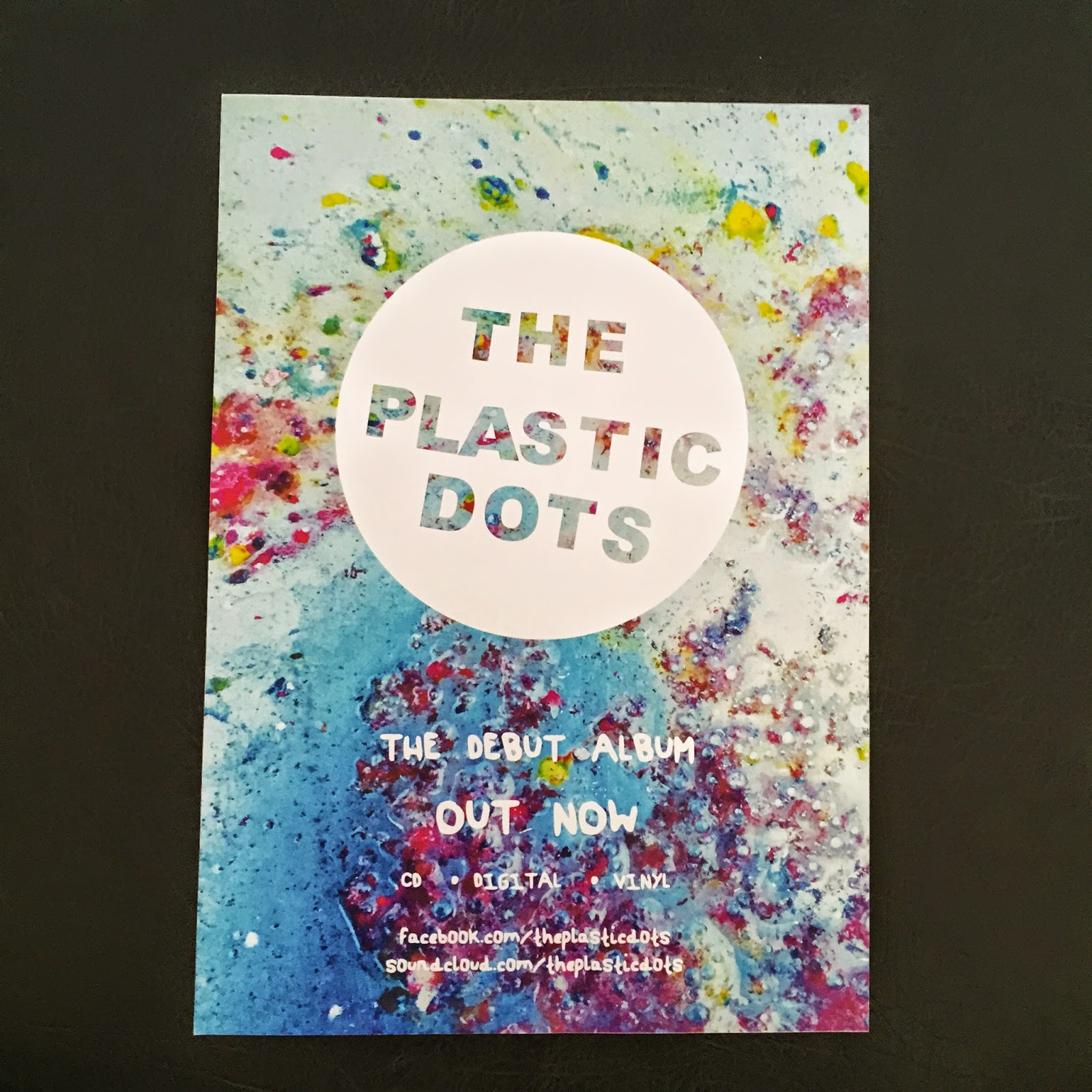
After completing the final drafts of the promotional package, the feedback from the focus group inspired me to consider the brand identity as something that can be continually developed. Reoccurring motifs such as the band logo and main image from the ancillary products could easily be transferred to merchandise, which is often a part of an artist's revenue.
Looking back to my digipak analyses, Reckless Kelly's website featured a 'store' section, whereby t-shirts, vinyls, mugs, and stickers were all available to purchase with the band logo on them, which forms Reckless Kelly's brand identity.
Considering these options for the artist of my promotional package, I checked their Facebook page to see if they had any existing merchandise. It appears at one point they sold t-shirts, which demonstrates that they would be open to the idea of furthering the brand identity through merchandise.

Because of this, I transferred varying designs taken from the promotional package onto the items below using Photoshop, demonstrating the possibilities of the continuation of the brand identity in forming the band's 'star image'.


Looking back to my digipak analyses, Reckless Kelly's website featured a 'store' section, whereby t-shirts, vinyls, mugs, and stickers were all available to purchase with the band logo on them, which forms Reckless Kelly's brand identity.
Considering these options for the artist of my promotional package, I checked their Facebook page to see if they had any existing merchandise. It appears at one point they sold t-shirts, which demonstrates that they would be open to the idea of furthering the brand identity through merchandise.
Because of this, I transferred varying designs taken from the promotional package onto the items below using Photoshop, demonstrating the possibilities of the continuation of the brand identity in forming the band's 'star image'.
I really like the idea of the promotional package becoming more than the music video and ancillary products, demonstrated through the t-shirt and mug designs above. Also, considering that the magazine advert advertises that the album will be released on vinyl, conforming to the fact that the indie sub-culture fuelled the revival of the vinyl. For this reason, I also designed a vinyl sleeve featuring the same layout as the digipak track list, but with fewer songs as the vinyl medium cannot hold as many as a CD or digital alternative. This continues the brand identity across another ancillary product directly aimed at the target audience.
Overall, a strong brand identity through reoccurring motifs and visuals has enabled me to create merchandise and ancillary products that are aimed at the target audience.
Sunday, 15 March 2015
Satisfied that I have a final draft of the music video, I sent the link to the artist of the track in order to gain their opinion on it. The response I received is below.

This positive feedback mentions the psychedelic colours, demonstrating that by including these in the introduction reiterates this aesthetic across the promotional package. They were very keen to use this for their own advertisement, showing that they are pleased enough to want to use it, which is a lovely response. Because of this, I am satisfied that I have created a promotional package which is positively received by the client.
Music Video - Second Complete Draft
Above is the final draft for my music video. Amendments from the previous draft include:
• Changes to the introduction, including adding the same photo from the ancillary products in order to strengthen the brand identity across the promotional package, as advised by my focus group. By cutting to the beat and alternating between vibrantly coloured psychedelic patterns from my digipak planning, this enabled me to both engage the audience through the visuals whilst strengthening the relationship between the track and the visuals. These psychedlic patterns also connote the indie-psych genre.
• Refining the lip syncing. After watching the complete video the whole way through, the matching of the lip syncing to the track was not as strong as it could have been, so I altered the placement of each clip in the timeline to strengthen this.
• I also verified my Youtube account in order to create a custom thumbnail featuring the artwork from the digipak, strengthening the brand identity further.
• I also verified my Youtube account in order to create a custom thumbnail featuring the artwork from the digipak, strengthening the brand identity further.
Overall, I am very happy with this video. Having never used After Effects or Premiere Pro before this project, the skills I have learnt through the construction of this video have only strengthened as the process continued. Whilst it did take very long to complete, I feel that this is part of a cohesive promotional package that I will submit to the band - The Plastic Dots - in order to gain their opinion as well.
Friday, 13 March 2015
Evidence
Below are two recordings of the focus group, utilising both visual and voice recording as outlined in my planning in order to retain as much feedback as possible from the session. I edited the voice recording using Audacity, before creating the album artwork to be uploaded on Soundcloud using Photoshop.
Analysis
After reviewing the feedback received from the focus group, I used Piktochart to analyse and respond to the comments received. Overall, I found gathering information through a focus group an effective way to gain qualitative feedback, enabling me to ask follow up questions unlike in hot desking, whereby the questions are set with no opportunity for me to change them during the process.
Friday, 6 March 2015
These drafts shall be presented to my focus group that is planned for the 9/03/15.
Things that have changed since the previous draft:

• The video is now complete. There are still elements I want to change (some sequences towards the end that are similar, the long introduction) but such adjustments will be more dependent on the audience's feedback.
• The first 3 sequences after the introduction [1][2][3]. These sequences have been changed a lot throughout the construction of this video. As they are towards the start, they set the tone for the rest of the video, so I want these to encompass the videos aesthetic to engage the viewer. The overall flow of the video between each sequence was the main consideration of mine even from the planning stages, and with the previous drafts, I felt that the contrasting imagery and grading created a quite disjointed aesthetic, going from an otherwise dark fluid sequence to a light, cityscape scene. In this draft, I was keen to keep the cityscape sequence [2] as it is quite different from the other shots, deciding to invert it to form a dark blue to a white/cream/blue grading. This made the features of the face and body more pronounced, highlighting the lip-syncing which denotes the performance aspect of the video, following Lynch's 1984 theory that all music videos contain at least one aspect of performance, narrative, or are conceptual. Following this, I decided to change the first shot of this sequence [1] to better suit the grading of the second shot. Using similar imagery from previous drafts, this particular footage changed from blue to cream grading, hence including the main colours from the sequence, strengthening the flow of the video. Because of these two changes, I also altered the grading of the third shot in this sequence [3] to better fit with the overriding blue palette of the previous two.
• First chorus, last line sequence has also been altered, the new version is [4] and the previous version is [5] . Featuring fireworks as outlined in my planning, I felt that whilst this was effective, James's face was too visible, loosing the subtlety from the previous sequences. I changed the grading using the Curves tool in After Effects, hence reducing the contrast the figure has. I also reduced the Tint on the overlaid fireworks footage, generating a more purple hue which mimics a similar palette from the previous sequence.
• The lacking definition within the hands on the instrumental sequences [6] was especially noticeable in the darker shots. In order to reduce the flatness and create the impression of 3D, I altered the keying to better isolate the green screen footage of the hands. I also used the Levels tool to adjust the shadows and highlights of the footage. This was repeated for each shot in both instrumental sections.
• I intended for the video to become gradually darker as it progressed, following the increasingly darker lyrics. For the third chorus, I originally had a fairly dark grading [8] however this was slightly too dark for it's position along the timeline, as well as appearing quite similar to the previous sequence. In order to maintain the level of visual interest, I overlaid multiple video channels to create a moving background, creating sequence [7]. Whilst I am pleased with this shot, it does appear similar to sequence [9] which comes two sequences later. I will put this to the target audience to see if they notice this similarity, and if it needs to be changed.
Thursday, 5 March 2015
Click and drag to move around the mind map
Sunday, 1 March 2015


In order for the focus group to give truthful feedback on the ancillary products, I made high quality prints of the advert and the digipak, enabling the audience to view the products as they would be should this promotional package be put into production. This also allowed me to view the quality of both products, as well as the legibility of the text. I deemed these elements fine, but I shall see if the target audience have any criticisms to either of these points.
Subscribe to:
Comments (Atom)