_______________________________________________________________________________________________________________________________________
Showing posts with label Construction. Show all posts

Merchandise

Friday, 20 March 2015

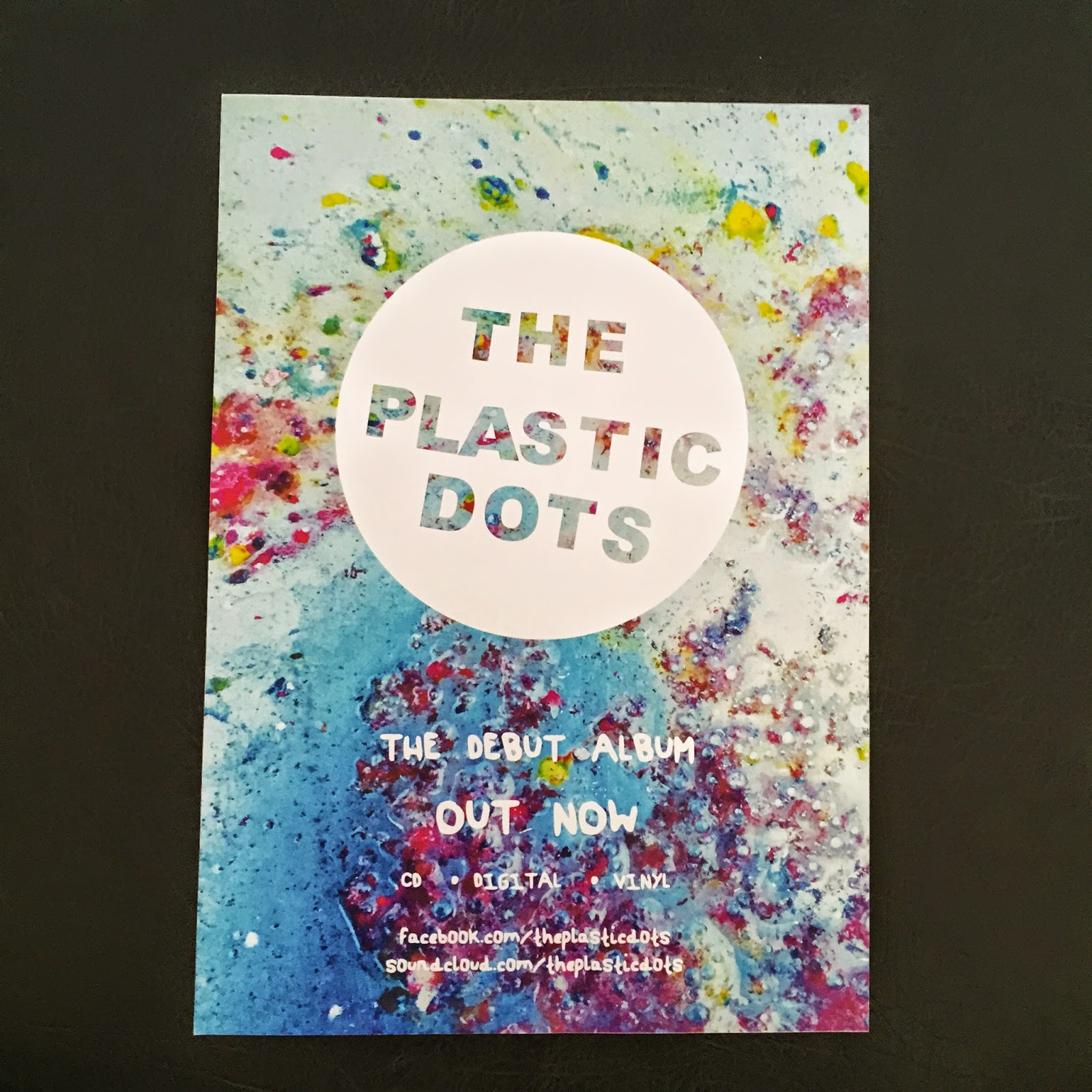
After completing the final drafts of the promotional package, the feedback from the focus group inspired me to consider the brand identity as something that can be continually developed. Reoccurring motifs such as the band logo and main image from the ancillary products could easily be transferred to merchandise, which is often a part of an artist's revenue.

Looking back to my digipak analyses, Reckless Kelly's website featured a 'store' section, whereby t-shirts, vinyls, mugs, and stickers were all available to purchase with the band logo on them, which forms Reckless Kelly's brand identity.

Considering these options for the artist of my promotional package, I checked their Facebook page to see if they had any existing merchandise. It appears at one point they sold t-shirts, which demonstrates that they would be open to the idea of furthering the brand identity through merchandise.

Because of this, I transferred varying designs taken from the promotional package onto the items below using Photoshop, demonstrating the possibilities of the continuation of the brand identity in forming the band's 'star image'.
I really like the idea of the promotional package becoming more than the music video and ancillary products, demonstrated through the t-shirt and mug designs above. Also, considering that the magazine advert advertises that the album will be released on vinyl, conforming to the fact that the indie sub-culture fuelled the revival of the vinyl. For this reason, I also designed a vinyl sleeve featuring the same layout as the digipak track list, but with fewer songs as the vinyl medium cannot hold as many as a CD or digital alternative. This continues the brand identity across another ancillary product directly aimed at the target audience.
Overall, a strong brand identity through reoccurring motifs and visuals has enabled me to create merchandise and ancillary products that are aimed at the target audience.

Music Video - Second Complete Draft

Sunday, 15 March 2015


Above is the final draft for my music video. Amendments from the previous draft include:
• Changes to the introduction, including adding the same photo from the ancillary products in order to strengthen the brand identity across the promotional package, as advised by my focus group. By cutting to the beat and alternating between vibrantly coloured psychedelic patterns from my digipak planning, this enabled me to both engage the audience through the visuals whilst strengthening the relationship between the track and the visuals. These psychedlic patterns also connote the indie-psych genre.
• Refining the lip syncing. After watching the complete video the whole way through, the matching of the lip syncing to the track was not as strong as it could have been, so I altered the placement of each clip in the timeline to strengthen this.
• I also verified my Youtube account in order to create a custom thumbnail featuring the artwork from the digipak, strengthening the brand identity further.

Overall, I am very happy with this video. Having never used After Effects or Premiere Pro before this project, the skills I have learnt through the construction of this video have only strengthened as the process continued. Whilst it did take very long to complete, I feel that this is part of a cohesive promotional package that I will submit to the band - The Plastic Dots - in order to gain their opinion as well.

Music Video - First Complete Draft

Friday, 6 March 2015

These drafts shall be presented to my focus group that is planned for the 9/03/15.


Things that have changed since the previous draft:

• The video is now complete. There are still elements I want to change (some sequences towards the end that are similar, the long introduction) but such adjustments will be more dependent on the audience's feedback.

• The first 3 sequences after the introduction [1][2][3]. These sequences have been changed a lot throughout the construction of this video. As they are towards the start, they set the tone for the rest of the video, so I want these to encompass the videos aesthetic to engage the viewer. The overall flow of the video between each sequence was the main consideration of mine even from the planning stages, and with the previous drafts, I felt that the contrasting imagery and grading created a quite disjointed aesthetic, going from an otherwise dark fluid sequence to a light, cityscape scene. In this draft, I was keen to keep the cityscape sequence [2] as it is quite different from the other shots, deciding to invert it to form a dark blue to a white/cream/blue grading. This made the features of the face and body more pronounced, highlighting the lip-syncing which denotes the performance aspect of the video, following Lynch's 1984 theory that all music videos contain at least one aspect of performance, narrative, or are conceptual. Following this, I decided to change the first shot of this sequence [1] to better suit the grading of the second shot. Using similar imagery from previous drafts, this particular footage changed from blue to cream grading, hence including the main colours from the sequence, strengthening the flow of the video. Because of these two changes, I also altered the grading of the third shot in this sequence [3] to better fit with the overriding blue palette of the previous two.

• First chorus, last line sequence has also been altered, the new version is [4] and the previous version is [5] . Featuring fireworks as outlined in my planning, I felt that whilst this was effective, James's face was too visible, loosing the subtlety from the previous sequences. I changed the grading using the Curves tool in After Effects, hence reducing the contrast the figure has. I also reduced the Tint on the overlaid fireworks footage, generating a more purple hue which mimics a similar palette from the previous sequence.

• The lacking definition within the hands on the instrumental sequences [6] was especially noticeable in the darker shots. In order to reduce the flatness and create the impression of 3D, I altered the keying to better isolate the green screen footage of the hands. I also used the Levels tool to adjust the shadows and highlights of the footage. This was repeated for each shot in both instrumental sections.

• I intended for the video to become gradually darker as it progressed, following the increasingly darker lyrics. For the third chorus, I originally had a fairly dark grading [8] however this was slightly too dark for it's position along the timeline, as well as appearing quite similar to the previous sequence. In order to maintain the level of visual interest, I overlaid multiple video channels to create a moving background, creating sequence [7]. Whilst I am pleased with this shot, it does appear similar to sequence [9] which comes two sequences later. I will put this to the target audience to see if they notice this similarity, and if it needs to be changed.

Physical Ancillary Products Drafts

Sunday, 1 March 2015


In order for the focus group to give truthful feedback on the ancillary products, I made high quality prints of the advert and the digipak, enabling the audience to view the products as they would be should this promotional package be put into production. This also allowed me to view the quality of both products, as well as the legibility of the text. I deemed these elements fine, but I shall see if the target audience have any criticisms to either of these points.

Magazine Advert First Draft

Friday, 20 February 2015

Referring back to my planning, I transferred my exact layout design to these first drafts, utilising the logo and handwriting font from the digipak. The vibrancy of the image is especially eye-catching, making it suitable in grabbing the audience's attention, fulfilling the purpose of an advert. This also features the digipak front cover, strengthening the brand identity.


In order to promote brand identity across the ancillary products, I also created a monochrome advert to correspond with one of the digipak drafts. Whilst this is effective, the patterned versions above are more eye catching and follow my original planning.

Digipak First Draft

Thursday, 19 February 2015


Digipak Construction

Wednesday, 18 February 2015

Font
The thank you note in the digipak is a space for the artist to write a sincere note directed to the fans. I wanted to portray this personal aspect through the font, and decided to create my own using my own handwriting to demonstrate this.

Using the website myscriptfont.com, I downloaded the template below that I then opened in Photoshop. Filling it in using a pen tablet, I was able to transfer my handwriting digitally, before uploading it to the website. This then converted my handwriting into a vector font which I am able to use within the digipak.


Barcode
As my planning outlined a monochrome design, rather than placing a found image of a barcode that often is either not transparent or features a conventional black banding, I decided to create my own. This enabled me to create a white transparent version that I can edit at any point. Using Photoshop once again, I created a brush 1px wide and 100px tall, and added this to my brush presets. From here, I changed the spacing of the brush to 100% and the count jitter to 120% causing the random banding that forms the actual barcode.

After placing this image into InDesign, I decided to remove the '3' and '0' from the edges of the barcode to create a more streamlined aesthetic that fitted well with the otherwise linear composition.


Outside Drafts
When constructing the digipak, I decided on these variations below. Whilst these are subtle, I intend to print each of these off to see how they look in print.

The above outlines my original design intentions through the planning. I decided to use the Arial Black font throughout to match the logo, listing the track names in a more graphical fashion. I personally find this combination slightly too impactful and linear compared to the circular front panel. Despite this, I do like the way the tracks list is arranged, filling the space well without becoming overcomplicated.

After printing these to get a sense for each colour, I actually really like the darker spine which is especially effective in linking these panels together. The thank you note on a panel on it's own is also rather impactful, which is evident in print, connoting the directness of the message to the fans.

Retaining the format of the track list, I used my own handwriting font that I created originally for the thank you note alone. I find this font impactful yet not overwhelming, with greater emphasis on negative space within each letter. In my research, I liked how The King Blues used handwritten font for each of their song titles, and this method transfers well to this digipak.

For this design I used grey as the background for the spines, but when this was printed the black version above was more aesthetically pleasing. I want to develop this design further, starting with changing the spine background colour.

Possessing the same features as the previous design, this version features quite an unconventional continuation of the spine through the different coloured background. This was quite effective for the back panel, however the inside flap with thank you note was really ineffective, with the off centred text and blank space distracting from the main message. The back panel is more successful, however the legal text and barcode would need to be shifted to the right to balance the layout more. Although, because the black spine was really effective, I won't be continuing this design due to the need of a different coloured spine.

A more obvious use of the psychedelic design than that in the planning, this is significantly different to the other drafts. The burst of colour on the front is balanced with a more muted purple taken from the front image. The white text contrasts against this background effectively, with the track list in a more conventional layout, integrating the circular design from the original logo also. The use of Arial Black from the logo follows what I had outlined in the planning, yet the handwritten thank you note does not overcomplicate the product, almost making this addition more personal.

I find this design slightly too dark, especially comparing it to the otherwise bright and vibrant video. Whilst the design is effective digitally, I found that it lost definition when printed. I think a brighter image will portray the otherwise colourful indie-psych genre more effectively, appealing to the target audience once more.

The previous pattern did not transfer well to the spine design, so I decided to use an image I had taken during the planning stages which had a greater amount of colour. Personally, I really like this design. It encompasses the vibrant indie-psych genre, as well as holding a slightly muted palette which can be likened to the 70s aesthetic. Accents such as the coloured spines create cohesion across the design, and is something that I believe can be developed for the inside sections.

With the success of the previous design, I used another photo from the planning process. Looking at the composition in general, I like how there is a greater variation between the black and white text, as the previous example I found the dark 'bonus tracks' buzz words quite distracting. The circular logo on the front panel is very eye-catching, but overall I still prefer the previous example as it appears more cohesive across the three panels.

In order to develop the previous example more, I shall change the logo to the circular example from the last one, as well as either tone down the buzz word colour, or change the thank you note colour to draw the attention away from this section. I also need to align the barcode with the track list and ensure that each section is to the correct width.

Inside Drafts
Developing the three most successful outside drafts, I looked back to my research in order to conform to conventions of a digipak. Each feature a pocket, CD with info, and the logo in the centre. The central logo is a clear focal point, reinforcing the brand identity which is especially vital as they are an unsigned and emerging band. The CD features the band logo once again, as well as the track names and durations, with the latter otherwise absent from the outside. Legal information conventionally circles the outside using a text on a path, with the disc logo also added to follow conventions. Upon viewing these drafts, I find the first and last versions most successful, spreading the focal point across the product, with an even dispersal of colour which is lacking from the middle draft. I shall show the two drafts mentioned to the target audience in order to gain their opinion on these versions.


Construction Update 13/02/15

Friday, 13 February 2015


Currently, the first verse, first chorus, first instrumental, second verse, and second chorus are edited. This is a significant change on the previous construction update, as my skills have improved in After Effects the time taken to construct each section has reduced, enabling me to be more efficient in the same amount of time.

Throughout the planning stages of this video, the instrumental sections were a strong consideration of mine, and due to the conceptual nature of the video, I decided to wait until I had edited up to this point to view how variety can be added in this sequence. The video so far is constantly focused upon the protagonist's head in either close-up or medium close-up in order to encourage the audiences engagement, with eye contact strengthening this throughout. With the aforementioned variety in mind, I wanted the instrumental to focus upon something other than the protagonist, deciding upon hands for their connotations of expression. This expressive nature is suitable for editing to the music, with the various movements reflecting the fluidity of the overlaid ink. The assortment of movements means I can transfer this to the second instrumental, with the continued use of the double exposure aiding the consistency of the video.

In this edit, I have also changed the lightning sequence in the second verse, third line. In the hot design exercise, this shot received mixed reviews as it originally moved from left to right, which some found disorientating considering the otherwise fixed point movement of some sequences. Also, looking back at my pre-production posts, when developing this sequence I liked how the lightning lit up the protagonist's features that are otherwise shrouded in darkness. Considering this, I have revised this sequence, keeping the shot static and with a monochrome palette, allowing me to easily blend the green screen footage with the background. This blend means that as the white lightning illuminates his features, succeeding in illustrating the pre-production intentions as well as adding drama that is referenced in the lyrics (Andrew Goodwin). Hopefully this change, as it is more consistent with the aesthetic of the video, will be better received by the target audience.

Looking back at my planning stages, I had intended for the video to become increasingly darker as it reaches the end, matching the darker, sadder tones mentioned in the lyrics, as well as the lack of resolution evident. The repeated line in the chorus "I just want to go wherever you go tonight" was illustrated using out-of-focus fireworks, yet to enhance this variety I have decided to use an ink in water shot that reminded me of clouds in the night sky. Once again, this doesn't obviously illustrate the mention of "tonight", however the monochrome palette definitely does. Although, this is not quite the end of the video, and as it has already reached black and white, I'm worried that the subtle change to monochrome will be diluted by this early inclusion. I may change this grading to a darker blue colour, retaining the nighttime connotations.

There are still some elements I want to change before I gather more audience feedback. For example, the map sequence of the third verse is quite subtle, with the lighter grading contrasting against the next darker shot. Also, as I am currently constructing the ancillary products, I have been inspired by the psychedelic patterns derived from the ink and water sequences in the video, so I have plans for the introduction to heavily feature this.

Construction Update 5/02/15

Thursday, 5 February 2015


Above is the first 30 seconds of my music video. This has been a long process so far, with on average each 5 seconds taking at least 18 hours to complete. From getting the keying precisely right, to looking at what footage fits well with what colour grading, this has been a difficult but rewarding construction so far.

Featuring the first verse, I wanted to group these four sequences by palette, sticking to a mainly blue/teal grading, as well as utilising the cross processing technique developed after researching colour grading. I decided upon this blue colour first due to the opening line "I stood beneath the floating waves" in order to illustrate this line (Andrew Goodwin's theory that the lyrics are illustrated through the visuals), yet this inclusion of the blue began to symbolise the otherwise relaxed nature of this first verse.

The visuals become increasingly dark as the chorus approaches, which was a deliberate attempt to make the bold chorus colours impact upon the viewer, creating a contrast of tone. As the chorus is repeated 4 times throughout the video, I really wanted this to portray the indie-psych genre through the use of bold colour and imagery to entice and engage the audience.

I was quite experimental in creating this sequence, gaining footage from a projection of abstract colours on a wall, creating layers of simulation. This projection created varied results, as well as adding depth and perspective to the footage, that I would not have been able to achieve through using the original flat colour sequence. Because of the variety evident in this sequence, this enables me to transfer a similar technique to the same line as it is repeated within the song.

Continuing the illustration of the lyrics through the visuals, the final line of the chorus "I just want to go wherever you go tonight" features a darker palette similar to the night sky. I first used a picture of the night sky as outlined in my storyboard, however this was not very visually interest, especially considering the length of this shot being conventional with the indie genre's slow pace of editing. Revisiting my primary research, outlined in my mood board was the use of bokeh; out of focus shots of light sources, creating delicate circles of light that are frequently utilised in indie music videos. I realised that the footage of fireworks would have the same aesthetic of the night sky, while adding movement, reiterating this visual interest.

Colour Grading

Wednesday, 31 December 2014


Double Exposure Techniques

Thursday, 25 December 2014

Construction Sketches - First Draft

Thursday, 18 December 2014

Hot Desking for Music Video

Friday, 5 December 2014


In order to gather qualitative feedback on the current draft of my music video, I utilised a Hot Desking activity among my classmates (who are within my target audience) to gage their opinions on the video so far, assessing aspects which work well and those that need amending.

Created using Canva

Initial Review

Sunday, 30 November 2014


After constructing the first three lines of the video, I was concerned as to the overall flow of each clip in relation to others, although I felt that the more abstract ink in water footage suited the double exposure edit, as well as corresponding to the indie-psych genre of the song.

On review, whilst the footage works well as a standalone clip, I find the contrasting themes distracting from the overall genre of the song. As I decided for my video to be a hybrid between both performance and conceptual - corresponding to Joan Lynch's 1984 theory that music videos fall into at least one of three categories: conceptual, performance, or narrative - I want to push the conceptual aspect to this video through the use of double exposure. Considering that the abstract ink blots are aesthetically effective when paired with this edit, this encourages me to consider further similar additions to continue this level of success.

Below are my construction notes which I completed as I made changes from the original storyboard, documenting the reasons for each change.

Construction Notes:


Audience Feedback:
Throughout my planning I was keen for each lyric to be illustrated in the visuals, following Andrew Goodwin's codes and conventions of a music video, as well as the director Dmitri Basil's work which I was initially inspired by. Upon viewing these lines edited together, I felt that the overall imagery was inconsistent, whilst retaining significance offered within the lyrics.

Keen to gather opinions on this, I asked those within my target audience between the ages of 16-21 for their opinions of the first three shots, specifically if they are consistent and if the imagery flows.
As expected, the overall response to the first clip was positive, with the audience agreeing that the ink and water suits the genre and style of the music video. The response to the two shots that follow this was an overall negative one, agreeing that they were inconsistent with the opening shot. Considering Stuart Hall's theory that we are currently 'prosumers', it is important for me to engage the audience in hopes of positioning the audience to experience a dominant reading.

Considering that my storyboard and production treatment outlines initial inspiration for each lyric grounded through the use of imagery, I would still like to retain this throughout my video. I believe that the framing of the two shots after the ink are the source of the problem, being immediately linear after an abstract, fluid sequence. I intend to rethink these two shots, with the aim to be to retain the illustrative nature of the imagery, to continue the flow of the edit.

Looking forward, I am aware of each edit in relation to it's place in the timeline, and shall reconsider the intended overlaid footage, comparing what shots follow the ink and water sequences effectively, perhaps bringing in more of this footage.

After Effects Workshop 3 - Particle Effect

Friday, 14 November 2014


Footage Review 9/11/14

Monday, 10 November 2014

As my storyboard outlines two separate lyrics whereby the concept of ink in water will be used, I refined this down to consider the shot type and framing I would need to achieve the high-contrast, close-up effect that I wanted. The lens would be extremely important in order to create this, so I decided to use my Canon 50mm Compact Macro Lens, which was able to focus closely enough to the water so that the added ink would fill the frame.

However, due to the short focal range the lens has quite a shallow DOF which caused some issues after the ink was added to the water and dispersed. In some shots there is a clear definition between the foreground, midground, and background of the shot, but this created some quite abstract effects that could resemble a stormy sky. As this is an element which I am repeating within the video, I believe these shots in particular may not be successful for this particular purpose, but can be repurposed to form said image.
Canon 50mm Compact Macro Lens

Canon 600D Review:

Footage Review 7/11/14

Saturday, 8 November 2014

Outlined in my primary source mood board was the possibility of experimenting with bokeh, and during each of my shoots I have compiled a few clips which correspond with this. As the strongest bokeh is created through bright light sources, I researched and found that fireworks are good subject matter for this, with the combination of vibrant colours and movement creating an aesthetic which will add depth to the double exposure edit.

Bonfire night and the respective fireworks displays fell into the period I had allocated for filming, meaning I had plenty of opportunities to film various displays. Looking at the local news website I had a clear view of the 'Big Boom' fireworks in the city centre from my house, so I decided to allocate filming time for this period.

The only camera I had available was the Fujifilm X20, which has previously offered varying results. However, after looking closer into changing the automatic controls, I was able to change the exposure down to a lower exposure, resulting in less noise in the final image.

Overall, after reviewing these clips, I obtained both focused and deliberately out of focus clips, each with correct framing as I prepared this before the show had started.

Fujifilm X20 Footage

Fujifilm X20 Review:

After Effects Workshop 2 - Motion & Multiply

Wednesday, 5 November 2014


After Effects - Title Glitch

Sunday, 2 November 2014


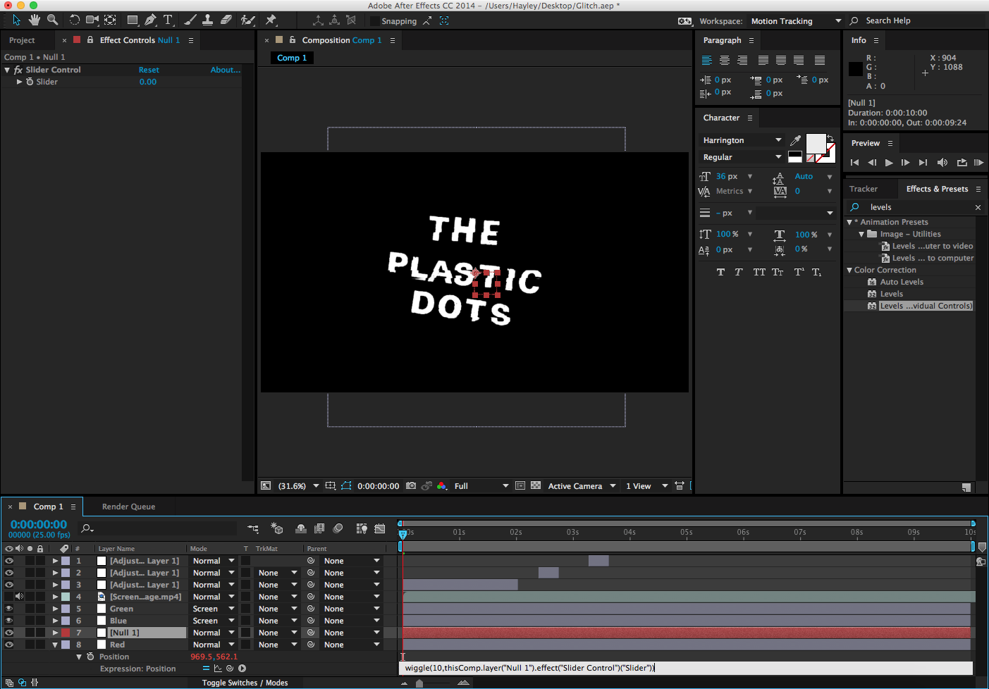
When creating the secondary source mood board, I came across some After Effects tutorials on Youtube, such as the one below. I decided to try this 'glitch' effect as it uses expressions which are a feature of After Effects which I have been wanting to try.


In order to have a foundation for this video, I decided to use the logo of the band I am using with their permission. Placing this image into photoshop, I created both transparent, monochrome, and stencil versions of this logo, which could be useful in future tests. The one thing which inspired me about the video above was the original simplicity of the logo, so I also isolated just the text from this logo, creating a slightly edgy, handmade feel to the final image, relating back to the more retro style of their music.

After isolating the logo, I transferred this into After Effects, along with some stock glitch footage which is available to use as part of the tutorial. Using a displacement map, I displaced the text (image) layer from the glitch footage, resulting in a clean glitch effect. I then staggered this effect across the 7 second clip, and varied each vertical and horizontal displacement to add interest to this feature.


In order to soften the glitch and create an effect similar to an older TV (relating back to that used by Dmitri Basil in the Riptide video) I used an expression, wiggle, to do exactly that. By creating a null layer and typing 'wiggle(10,' this set the value of the expression. then, clicking the spiral button, I linked this to the slider control, meaning that whatever I set the slider to, this will effect the intensity of the wiggle. Despite only touching on expressions, they are far more simpler than having to animate each individual keyframe, and could be useful in my final video.

Taking this a step further, I then isolated each layer into red, green, and blue channels using the 'Levels (individual controls)' effect, and setting the layer mode to screen. From this, I decided I wanted to separate the red channel, so used the shortcut 'P' to open the position tab, before altering this, resulting in the red/blue shift above. This was effected by the expression and displacement map, resulting in an effect you would see on an old, broken monitor.

Overall I'm really pleased with this title effect, and could see it being used either at the start or at the end of the video. As it is transparent this can be overlaid onto existing footage, making it a versatile title.

Footage Review 31/10/14

Friday, 31 October 2014

As the majority of the footage I need is dependent on weather, I was able to shoot tonight with both the 600D and the X20. After the previous unsuccessful shoot with the Fuji X20, I wanted to see if this was down to the particular conditions, or whether the lack of manual controls (including lack of manual focus) means that the clips are soft.

After reviewing the footage from today, I found that the Canon 600D was far more successful than the Fuji X20. Only the final close-up footage was successful to use in the final video, meaning that this camera is in a further niche. Although, as I had two tripods available, this meant that I could simultaneously film on both cameras, meaning that I was able to obtained the aforementioned successful footage from the Canon 600D.

Below is the raw files from today:
Canon 600D Footage

Fuji X20 Footage

Canon 600D Review:


Fuji X20 Review:
_______________________________________________________________________________________________________________________________________